

Mobile Leads with Speed in 2017
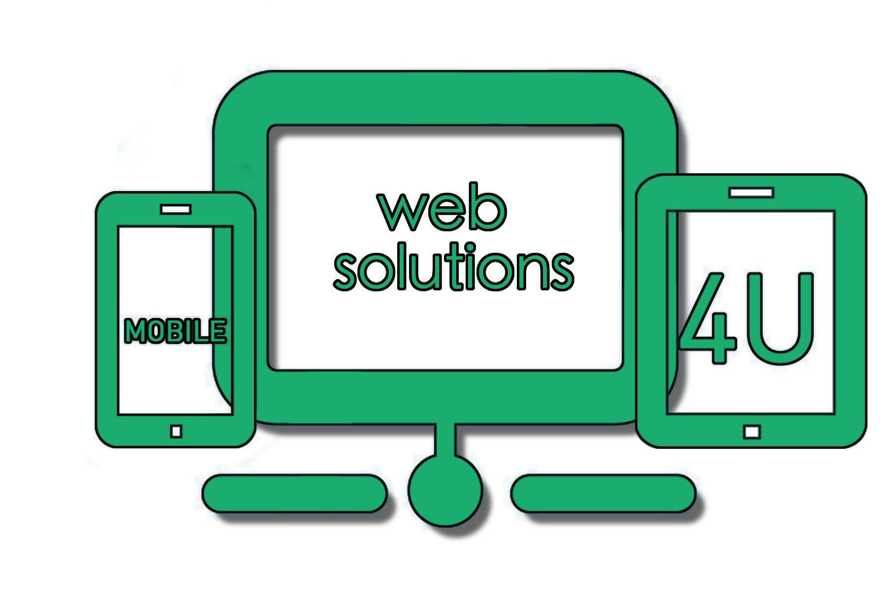
We are the home of the latest technology of Leading Edge Multi Screen Websites and State of the Art Mobile Websites.
Let’s be upfront, the world of web design can be puzzling. It’s an industry which the newest and greatest technologies are (along with their pros and cons) can be complex. We built & design both Multi Screen Responsive Websites and Mobile Platform Solutions(Mobile Websites). Our Mobile Sites are adaptive and will deliver unique Mobile Platforms depending on the smartphone device type that visits the site. This means the mobile site will be completely different than (and separate from) desktop.
Mobile Web Solutions 4u MULTI SCREEN WEBSITES are completely built with a responsive design concept. Multi Screen Websites are the latest revolution in Website Design. Responsive is an easy way to explain how the website automatically adapts to fit the size of the screen it is viewed on. Although, there are many different ways to build sites that work on all devices; which can make your Multi Screen website responsive. On smaller screens, content blocks will stack on top of each other for easy mobile viewing.
Building a responsive website is not exactly an easy undertaking, as you have to examine on many different devices and screen sizes for every page of your site.
Lastly our responsive design is both responsive plus server-side support (sometimes called RESS or dynamic serving). This means the website will always check which type of device is being used on the back-end, prior to the site being loaded, then displays responsive content specifically adapted for that device type.


